by Omar Ozenir
http://geldurkal.blogspot.co.uk/


http://geldurkal.blogspot.co.uk/

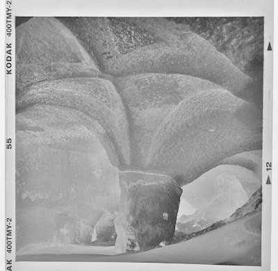
We'd been rambling around the Zelve valley in Cappadoccia for hours and were exhausted. Close to the exit, at the bottom of an uphill dirt track, I saw a sign that said, "Pillared Church". After hesitating for a moment I decided to give it a shot. A short climb and I was in the cave, which looked rather uninteresting at first sight; much like the hundreds, if not thousands of caves in the region. However, since the rest of our small group had decided to make a dash for the car to gorge themselves on the waiting cake, I was alone and after a while the silence and the cool moist air smelling of earth started to grow on me.
First, I made several pictures from the other side of the pillar. But my last frame was reserved for this "X" on the ceiling. My tripod and camera were almost level with the ground. I moved the shutter speed dial to bulb, fixed the cable release, checked my watch, released the shutter, and whilst counting the 30 seconds imagined how the very low light was slowly penetrating the emulsion. It was only after printing the picture that I realised that the pillar and ceiling look like a giant mushroom about to topple over.
I find it remarkable that a thousand years ago a group of Christian people not only carved out a small cave-church into the tuff (consolidated volcanic ash), but also had the sensibility and desire to decorate it with this pillar and fantastic ceiling.
The darkroom story
I used a Rolleiflex TLR camera with an 80mm lens. The standard 80mm of 6x6 medium format cameras is an intriguing focal length. Depending on how it's used, it can give both a wide angle or a short tele effect. In this picture, there is a strong wide angle impression due to the way the ceiling curves toward the viewer.
The film used was Kodak Tmax 400 which I developed in home made ID-68, which is said to be similar to Ilford Microphen.

Despite the richness of detail we have a negative of relatively low contrast. My aim in the print was to bring out the "X" as impressively as I could. As you can guess from the neg above that's not going to happen with normal contrast filtration, especially not in the centre area. After some trial and error I decided to go all out with grade 5 (the highest contrast filter for those who are just starting printing).
My starting point was the very centre of the pic, i.e. I was going to establish the exposure time and contrast for this area and would burn-in the rest. What could that be? If we look at the neg again: density increases toward the top, that would need some balancing; the left and right top corners are even denser and these areas would need even more exposure. I'm using the word "need" but there is no need of course. We could just leave it as a straight print. But if you do that you'll see that the eye will escape from the corners. What I want is that the eye returns to the "X" after roaming around the pic; darkening the corners helps in this respect.
Let's move on...I'd like the lower right corner as pure black, that area will need some heavy additional exposure. Seeing how there's a triangle in three corners, I went ahead and put a false (in the sense that it does not exist on the neg) black triangle into the lower left. Blasphemous? Maybe.
After many test strips and several hours I finally printed the photo as shown in the printing plan below.
After many test strips and several hours I finally printed the photo as shown in the printing plan below.

The main exposure was 13 seconds at grade 5, during which I dodged the area in green for 5s with my hand. The reason will become obvious in a moment.
From here onwards all additional exposures were at grade 3.5 because the contrast outside the centre area is quite decent.
Since the right side of the pillar printed too white with just the main exposure at grade 5, using my hand I gave an additional 5s below the brown line. Shading the green area before was in order to prevent it from turning pitch black. Now, there's the tiniest of detail visible, which, as usual, is lost in the scan.
Moving on to the ceiling...with a piece of cardboard I gave 6s above the red line, 20s to the top left corner, and 4s to the top right corner.
The lower half of the yellow line received 13s. Then, I opened up the lens aperture completely and by exposing the lower right and left corners below the orange lines for a further 10s ensured they were completely black.
And finally, I slightly deepened the tone beyond the purple lines by burning in the narrow edges for 2 more seconds.
Because of the dominant brownish colour of the Cappadoccian landscape I wondered how a slightly sepia toned version would work. If you consider toning, which has it's own unpredictabilities - especially if you don't do it routinely - having a few identical prints at hand is not a bad idea. In this case I made three prints.

My idea was to tone two prints and leave one untoned (the main photograph at the top). One print was bleached for 1.5 minutes, the other, which you can see below, was bleached for 3 minutes which caused a rather strong sepia tone. I went too far by further selenium toning this print for 7 minutes in a 1+9 dilution of Kodak Rapid Selenium Toner. In hindsight, I think the purplish darker tones that the selenium imparted don't fit the subject at all. Well, I'm glad that I had made those three prints since the untoned version pleased me the most in the long run.
 |
| Sepia + selenium toned print. In hindsight, a poor combination for this picture |
I hope that this long-winded explanation doesn't put off novice darkroom enthusiasts. Some prints are more difficult than others, but in many cases, especially if you have a good negative, a perfectly satisfactory print can be made in 10-15 minutes. After all the work is done, the joy of holding the lovingly crafted print is a pleasure in itself...often you'll say, "it was worth it!".


Hi there.
ReplyDeleteAnother excellent print and explanation. I'm learning a lot from this small lessons, especially how to direct and focus the eye on the print. At the point I am with my photography I feel the need to move a bit further from a merely "technically correct" print and your articles seem to point me in the right direction and inspiring me to experiment a bit more. Thank you for sharing your techniques and also thanks Bruce for hosting.
Cheers, M,.
Thanks for posting this article Bruce/Omar.
ReplyDeleteAs a Printing Novice I really struggle with Dodging and Burning-in, but this shows what can be done over and above a straight print.
After reading this I re-read the Dodging and Burning-in chapter of Tim Rudman's book 'Master Printing Course'. In it he states that 1 important item to have is a wastebin - he says 'If you are not filling your wastebin you are probably not taking risks and, therefore, not learning....Consider reject prints not as failures but as steps to success.'
At the moment I can fill a bin just to get to get a straight (reasonable) print. It looks like I need do more to go beyond a reasonable print.
Thanks for the advice.
Vic
Thanks, for this detailed explanation. I learn something ever time you post.
ReplyDeleteI'm glad you added the last paragraph because I did find the description a little overwhelming thinking well I'm never going to put that much effort into a print but I suspect that I will be drawn in to the dark side of the art as I continue with my own efforts. I have tried some dodging and burning with effect but I have never really tried to read a negative and try to plan the print. That is the take-away for me i.e. just stand back from the negative and/or initial test print and have a little "think". Thanks for that.
ReplyDelete