
It's not unusual for me to see crops in pictures taken by other photographers but it seems I need to develop the knack of looking at my own a bit more critically. I'm not fetishistic about it but I do like to fit the composition to the 35mm frame at the taking stage rather than mucking about afterwards looking for a better crop.

Thank you, David! This shows two things: David has a good eye and I need to look more closely at the negative or print to see if I can see a tighter crop that strengthens the composition. Where the first pic is concerned, I agree with the CropMeister that it's stronger as a square. That means losing the right hand side and the shadow that drops off the frame right in the corner, something that I took care at the shooting stage to achieve. David noticed that the square reduces the scene to pairs of objects: chimneys, lamp-posts and ventilation boxes. That does indeed improve it, in our shared opinion.
The second, earlier, pic he cropped was a shot of my stairwell at home. David's version keeps the light and dark shapes but, by removing most of the window, lends it an air of mystery. It's still recognisable but you have to look a little longer at it. I don't think the crop in this case is a huge improvement but, overall, I prefer it and will probably print it closer to the square format.

The key with these light and shade photographs is to concentrate on the graphic side of things and remove the representativeness from the frame - but not to the extent that it just becomes an indecipherable pattern shot. Unless you want a pattern shot, of course.

So, I'll continue in Cartier-Bresson fashion to stick as far as possible to the 3:2 format when composing with 35mm but now I'll pay a bit more attention once I have the negative under the enlarger or in the scanner to see if there's a better crop lurking there.
After writing the foregoing and before I told the CropMeister that he'd be featuring in a post, he sent me an email about cropping that I thought would be instructional. So I've appended his words below. My original photograph comes first and David's suggested crop second. He started by quoting my words from Friday's post when I was dismissive of a few photographs of my own. If you haven't read Friday's post, it would probably be good to do so first.
...not the graphic ones I'd hoped for but it's early days.
And
And old habits die hard..
Aha, I thought. I think you’re wrong. And you’re right. I think you’re seeing them graphically, but then, as you yourself note, photographing them with “old habits.” I’ve taken a great liberty and cropped some of your shots. it’s a very wicked thing to do. I really don’t want to suggest that my crops are actually better, but only that they’re done with a second pair of eyes – eyes three and four, if you like.
I do have a small advantage, perhaps, in that I have no memory of the original scene. This is meant to encourage you, but if you don’t approve or don’t feel encouraged, I must apologise. A word from you and I shall stop. So, grovelling as much as is consistent with reaching the keyboard, here goes…
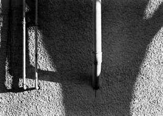

Very elegant I thought, but on the left is a bright stripe that competes in both brightness and size with the white pipe. It make the eye scoot left-right-left-right, slithering over the two interesting smaller pipes and their interesting cast shadows. I don’t suggest that this is the best crop, only that it reveals your inner Gibson. I think this is the ‘image' that your mind saw, but as you say, old habits took a more literal “picture”. Maybe, but only maybe, a sliver off top and bottom to conform to 35mm shape.
………...


A nice little rhyme between the sloping lamp-post shadow and the sloping cast shadow on the left, punctuated by the round thingy. I thought that there was far too much information about bricks at the bottom. I also thought that an extra sliver on the right would help to show the other end of that bracket thing.
………...


The mysteriously phallic landscape. You were actually more interested in the bird, so I’ve given it a bit more emphasis, by cropping. As the symmetry was already broken by the road signs, it seemed that the repeat of the road on the left wasn’t earning its keep in the picture space. Now, I suggest, the important and attention-grabbing bird is balanced by the odd-looking silhouettes of assorted posts and poles.
Perhaps in this version, the right hand cloud is a teeny bit emphatic, or possibly the bright horizon on the left a little reticent. The irregular curve of the road, leading to nowhere seems more interesting like this, too. This “nowhere” holds the attention a little longer, perhaps.
…………


Another image where your pictorial kindness has left too much information in the frame. Again, I can’t suggest that this is the best possible crop but there is interaction between the hard shadow at the bottom and the wispy one a the top. Then it becomes an image about different kinds of verticals. Somehow, I haven’t got it quite right. Either the top or the bottom need a tiny trim and I can’t decide.
……….
I can well understand David's reticence when it comes to cropping other people's photographs as there are some right touchy buggers out there! Lucky for David, I'm not one of them. Haha! I find this sort of exercise makes me think more about my own photography and that can never be a bad thing. As I said to him, the moment we think we know it all, it's time to pack it in.


Very good illustrations-excellent raw material before making your technical points
ReplyDeleteCropping: I do gratis work for a local theater group. The director wants studio quality, but it has to be done in a closet (and the closet was so small the bounce flash had to be turned down to 1/16). Two nights ago, I was baked up into a wall with the subjects backed up onto the opposite wall. Sometimes you just have to crop.
ReplyDelete