Some readers who frequent the Film and Darkroom Users' Group (FADU) may have seen this article on split grade printing by photographer Les McLean. If you haven't and want a detailed introduction to this particular technique then this post is for you. Les kindly gave me his permission to republish it here. Sometimes darkroom techniques can seem a bit of a palaver but they're worth it when you arrive at a print like the one below. So if you haven't tried split grade printing or post flashing then I hope this encourages you to give them a go. Many thanks to Les for his generosity.
Thanks also to David M. for reminding me about this article. While I've been redecorating my home, David has been getting through coffee by the gallon sitting in front of his laptop and sending me info, web links and suggestions for posts. It's been a huge help as I've had hardly any time over the past few weeks to think of things to write. Next time I'm down your way, David, I'll treat you to a sarsaparilla.
Finally, if you haven't joined FADU then please consider doing so. They're a great bunch of people and very friendly and helpful. You can register here.
The Power of Split Grade Printing and
Post Flashing
By Les McLean
The development of simple split grade printing has given traditional darkroom workers the ability to quickly and consistently produce high quality prints from well exposed and developed negatives. However, for various reasons, we don’t always get it right at the exposure and development stages, resulting in a less than satisfactory negative.
In the days of graded papers, making a fine print from such a negative could be a struggle and could sometimes end up in having to accept compromise, for the final image that was put on the paper tended not to live up to the original visualisation. Controlling the contrast in the negative is key to making the best possible print but when we mess up in making the negative it is the contrast that suffers, either too much or too little is usually the result.
For many years I considered high negative contrast to be an enemy but in the early 90’s the introduction of good quality variable contrast paper gave me, and all printers, an extremely valuable tool in this battle with contrast.
After a short but concentrated spell of darkroom experimentation using variable contrast paper I soon realised that rather than negative contrast being an enemy it was indeed a very strong ally. As a result of this, and because VC paper offered printers the ability to use more than one grade on the same print I continued to experiment in the darkroom.
I tried many variations of applying different grades to individual areas of the image and trying to express exactly my visualisation at the time of exposing the negative. After a few short weeks of experimentation I arrived at the basis of the grade 0 and grade 5 method of split grade printing in conjunction with a higher than normal negative contrast and have used it since then.
Through the years I have experimented in my printing to bring together different ideas and combinations in the search for improvement in the final print and this article explains one such combination that I frequently use when faced with a difficult negative.
Making the print “Detail Roughting Linn”
The negative
The making of any high quality print starts with the production of a well exposed and processed negative. However, having said that, I acknowledge that personal preference and subjectivity are factors that have to be considered. For example, I know of a number of photographers who produce quite beautiful prints from quite thin, flat negatives.Clearly, what the photographer may visualise as the final print will have a bearing on the type of negative that will be made. I aim to produce what I call the expressive negative that will, in most cases, allow some flexibility in interpretation when making the print. To this end, I now prefer to produce a negative of higher than normal contrast where possible in order to maximise on the contrast control available when split grade printing using grade 0 and grade 5 only. To achieve this I meter the deepest shadow and close down the lens by one stop or, in Zone System terms, place the shadow on zone IV to produce a negative with maximum information throughout.
Until about five years ago I would use Rodinal, ID11 or HC110 to develop the negative and, in conjunction with exposure at the taking stage, push or pull development to achieve the required contrast. I now use the staining developer Precsysol or Precsysol EF almost exclusively to produce a very satisfactory negative that enables me to make the print that I visualise at the time I make the exposure. Development is either normal agitation for the 8.5 minutes development time or partial stand development for 10.5 minutes. Fig 6:

Making the print
I always make the grade 0, or soft exposure, first and the logic I apply in choosing to do this is that I prefer to build contrast rather than to start with a high contrast test strip from a grade 5, or hard exposure, and work to reduce the contrast.The analogy that I make about this approach is to compare it to building a house from the foundations through to final completion - the foundation in the print being the soft exposure followed by the hard exposure to determine the initial level of contrast which I can then adjust by using other means such as burning and dodging, flashing, water bath or two bath development.
The prints used to illustrate this article were developed for 3 minutes in Ilford Multigrade Developer diluted 1 – 9, plain water was used as a stop bath and the prints were fixed in Ilford Hypam diluted 1 - 9 for 4 minutes.
The test strip
I make the test strip in two stages, step one is the grade 0 or soft test followed by step two, the grade 5 or hard test. I make the soft test strip first and dial in grade 0 on the enlarger and use the f-stop printing method of timing the exposure.When assessing the soft test strip, I look for the first sign of photographic tone in the highlight. At this stage I am not concerned with seeing contrast or tones anywhere near approaching a full black. Contrast and rich blacks are produced when the hard filtration is introduced.
My choice of exposure for this print is step six indicated on the illustration with a star - fig 1.

The decision to choose this step was based on the tonality toward the top of the step. Note the complete lack of tonality at the bottom of the same step where water is striking a rock and bouncing back to create an area of intense white water. Had I decided to use that area as a guide to my highlight exposure the other areas of water would have been given too much soft exposure and rendered a tone that was too dull and muddy.
Sometimes I do choose the brightest highlight in the image to make the decision as to how much soft exposure to give. The judgement relating to this choice is, in my opinion, always a critical decision, for to get it wrong and give too much soft exposure generally produces lifeless prints. Clearly, the tonality and contrast of any print is a very personal choice and what I describe here produces final prints that I like and I am not saying that different contrast and tonality is wrong. I cannot emphasise enough the danger of attempting to produce contrast in a soft test strip.
To make the hard, or grade 5, test strip I first give the whole test strip the exposure that I have chosen for the soft filtration, in this case 21.3 seconds (fig 2) where the first step shows that soft exposure.

Leaving the test strip in place I dial in the grade 5 filtration and make the second set of exposures. Comparison of the two test strips will show the increase in contrast as more grade 5 exposure is applied but very little change in the density of the highlight. The reasons for this are a combination of the high density of the highlight areas of the negative which acts as a mask when applying the hard exposure, and the high contrast factor of the hard filtration.
This is why I prefer to work with negatives of higher contrast that I mentioned earlier in this article. For my hard exposure of 28.5 seconds I chose step eight on the test strip marked with a star. Note the appearance of the curved rock behind the bright highlight area of water at the bottom of the test strip which is the direct result of exposure to hard filtration. Fig 3 is a straight print using 23.1 seconds grade 0 filtration and 28.5 grade 5 filtration.

My visualisation
As I stood in front of Roughting Linn I was attracted by the elegance of the gentle curves running diagonally from top right to bottom left and I decided that this would be the main feature of the image and would therefore be the most delicate tonality.The flow of water falling straight down just off centre provided a good strong counter point and though, in reality, it was of similar tonality to the curved water flow I knew that I would print it slightly darker so as not to compete. The rock face in front and behind the flow of water was unevenly lit and is of varying tonality in reality but I wanted to use it to provide strength and the feeling of power without detracting from the gentle subtleness of the water. I now had to use various simple darkroom methods and manipulations to being my visualisation to life.
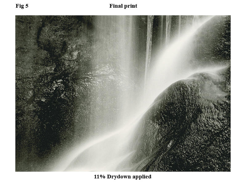
The final steps
Perhaps the best way to describe the work done to produce the final print is to list the steps shown on the print burning plan (Fig 5).
1: I burned the whole of the left side using both grade 0 and grade 5 filtration to balance the tonality with the remainder of the rock face. Had I used only grade 5 it would have increased the contrast to a level I felt to be unacceptable. Grade 0 would have reduced the contrast and produced a muddy end result.
2: Burn the bottom left corner to match the area immediately above. I used both grades for the same reason as above.
3: Burn top left hand corner for same reason as burn 2.
4: I burned this area using grade 5 only because I wanted to retain a little of the contrast between the icicles and the darker background. Had I introduced grade 0 here I would have reduced contrast and as a result reduced the separation between ice and background.
5: The flow of white water is quite strong in this area and I wanted to reduce the brightness of the water and darken the rock face but needed to retain some separation in the rock therefore burning in only with grade 0 was not an option.
6: It was important to me to render this area of rock in a quite dark tone to imply power and strength therefore the temptation was to burn only with grade 5. However to do that would have slightly increased the contrast which was unacceptable. I therefore split the burn, using grade 5 to add a brittle density to the darker tones, and grade 0 toned down the specular highlights and brought a subtle roundness to the rock face.
7: I burned here with grade 5 to darken the curved rock behind the flow of water and knew that the burn would not significantly affect the tonality of the water.
8: This is the only area that needed any dodging and this was largely to eliminate spillage of light that always occurs during burning in. During the basic exposures I dodged 10 seconds grade 0 and 8 seconds grade 5.
Post flashing
The final step I made in the making of this image was to post flash the whole print and, in addition, give a local post flash to the brightest water highlight at the bottom of the image (item 7 on the print burning plan).The first step when post flashing is to give the basic image forming exposure, in this case 21.3 seconds grade 0 and 28.5 grade 5 - the basic straight print exposure. After making the basic exposure, leave the test strip in place and, using an independent white light source, make a series of short exposures as shown in Fig 4, the flash test.

I use the RH Designs Paper Flasher. Develop the print using your normal method and assess the highlight area of the image. When I plan to give the whole image the post flashing exposure I look for the first sign of tone in the brightest highlight and apply that when I’ve made the print and carried out all burning and dodging manipulations required.
In this image I gave a 4 second post flashing exposure to the whole print and a further 2 seconds local post flash to the brightest highlight in the water (item 7 in the print burning plan).
For the post flashing test reproduced here I made more exposure steps than necessary to show the effect of over flashing the image. You can see that at 8 seconds the paper is obviously fogged.
Tips for burning and dodging
I have often been asked why my burning in times appears to be quite long in relation to the basic exposure I give. The simple answer is that when burning in I the black card I use is moved in a rather exaggerated manner around the area I’m working on. Consequentially, the amount of image forming light actually hitting the paper is reduced.I also use a very soft pliable card generally bent into a “V” shape and work it back and forth across the area I’m burning in. The card is always held as near to the enlarging lens as possible so that the light falling on the paper has a soft edge, known as the penumbra, that allows me to feather the light so that the burning in join is smooth and well disguised.
I dodge with either a piece of thin oval shaped card about 1.5”by 0.75” attached to a thin length of flower arranging wire and if necessary I cut card to the shape I am dodging. I also hold the dodger near to the enlarger to create the penumbra effect I mentioned above.
Conclusion
Split grade printing together with post flashing as I have described here is used for about 75% of the prints I make. The method is relatively straight forward and gives me good control over the process of making prints. The power of using higher than normal contrast negatives together with grades 0 and 5 allows me to produce the contrast I visualised at the taking stage with great accuracy and speed.The use of post flashing should not be dismissed. I often hear photographers say that flashing produces flat prints, that is true but the use of flashing is not the issue, the problem is the judgement applied by the printer. Of course too much flashing will fog the paper as I illustrated in the test shown in fig 4. One of my favourite ploys when printing is to deliberately print to a slightly higher contrast than I want and post flash the print very lightly to reduce the overall contrast to what I require.
These are powerful tools to use in the making of fine prints and I would encourage you to spend some time in becoming familiar with them. I’m sure that you will not regret it.


Great article although I prefer pre-flashing as it catches the paper unaware.
ReplyDeleteHa yes Andrea, have to have the element of surprise!
ReplyDeleteI quite like the split printing approach, and have one particular image which would have been very hard to print without it and (in my case) pre-flashing with green light. It has a shaded area between buildings which needed full-on grade 5 to get any reasonable contrast, but also has some bright sunlit areas (including a white car) in the upper half of the frame. Luckily the divide between the two parts was quite hard and straight.
With pre-flashing and split printing I was able to print the sunlit half at a very soft grade, with the shaded half at maximum contrast, capturing what my eye saw much more closely. I might not even have really needed the pre flash.
Awesome article. I have been using split grade printing for about a year with good results. It's always good to hear how others print, as I always pick up helpful tips. However, I have never heard of post flashing. Can you explain in more detail why and how you post flash. If you have properly exposed with Grade 0 and Grade 5 based on test strips, and later burned/dodged properly, shouldn't you have a good print? Why would you then come back and flash it to tone it down?
ReplyDeleteThanks.
Charlie