 |
| Click to embiggen |
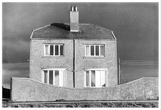
On one of our excursions a few years back to the Cumbrian village of Allonby, made somewhat famous by the late Ray Moore, I couldn’t help but search out “Ray’s house” just to see if it was as aesthetically-challenged as his picture of it had suggested.
For those who haven’t heard of Ray or were never taken by his work - and it’s an acquired taste - the house featured in his 1984 book Every So Often and became known for it’s unglamorous facade. Some would say “ugly”.
I found the house easily enough though it’s seen some alterations over the intervening years. I decided to photograph it with my old Rollei 2.8F. As a way of adding to the ugliness I included the not-too-pretty concrete bench in the foreground.
My pic was actually made a while back and uploaded to the Blogger platform that forms the backbone of this blog at that time but never published. I came across it yesterday whilst having a coffee, looking through the blog and thinking that it’s about time I wrote a new post.
So here it is - a new post featuring an oldish photo. I think blogs are slowly dying a death, which is a shame. They’ve gradually been taken over by video platforms but, when it comes to video, I have a good face for radio so I’ll be sticking with the blog.


Over the ensuing years I note that there have been some inspired flourishes to this house. The addition of a satellite antenna and the chimney removal have certainly cheered up the front elevation.
ReplyDeleteHowever, I would contend that whatever is done to this house will be unlikely to improve its appearance.
There is a house in Beckenham in south-east London that suffers from this problem. When I first noticed this "carbuncle" the exterior brickwork, made of common fletons, which had been painted a delightful bilious yellow, left me speechless, I had to stand on the opposite side of the road and stare in awe at the stupendous lack of taste that the builder, architect and QS must have been infected with.
Twenty or so years have passed and recently I noticed that it had been "updated", it has now been sprayed with that air filled, pre-coloured bright grey (if there is such a colour) concrete render that has become available since., and it is just as hideous as ever.
The thing is, this is a decent sized house in a very middle class area and despite its sorethumbishness, it always sells.... presumably to an accountant or somebody equally inspired.
Thanks for taking the trouble to track down the old photo and making the companion one Bruce. I've always enjoyed then/now photo projects like this. Funny they split the wall like that - kind of destroys the symmetry but then again it could be just the perspective.
ReplyDeleteRegards
Dave