What was it Forrest Gump said about life being like a box of chocolates? Almost six years ago, we moved to St Andrews in Fife and I remember vowing that the only way I'd be moving house again was when I'm carried out in a box. Well, as it turns out, boxes were involved but I was the one doing the carrying - metaphorically, as my brilliant sons did all of the work (I also have an equally brilliant daughter but she lives in England). Yes, we've moved home again but this time it's DEFINITELY for keeps..
We're back in the county of Angus to be nearer one of the aforesaid sons and his family as the two-hour round trip from St Andrews was just enough to discourage regular visits. There hasn't been much time for photography, needless to say, but things are beginning to return to something approaching normality so I thought I'd update the blog.
Those pictures I have managed to take have mostly been whilst out and about with Oscar the Dashing Hound during our evening walks - and mostly on the iPhone 16. But I also bought a Nikon LS40 scanner before we moved and I'm really just beginning to find my way around it, with lots of neg sheets waiting to be immortalised in pixel form.
I was discussing a scan that I'd printed out with Phil Rogers and thought it might be interesting for some readers who like to use a hybrid workflow where they shoot on film and print on an inkjet. The negative in question is a Delta 400 effort taken on a Minolta XE-7 using the 50mm f1.4 PG Rokkor. Here's the beastie.

I took it a couple of years ago and it shows Craigtoun House near St Andrews in the mist with a striking tree doing some framing. The neg is quite low contrast, as you'd imagine on such a day. Instead of increasing the contrast through levels or curves in Photoshop, I like to duplicate the image and then blend it using "overlay", adjusting the opacity to let the effect shine through to a greater or lesser degree.
There are all sorts of "blend" settings and it's worthwhile having a go with some of them to see if one throws up something a bit unusual. My normal "overlay" increased the contrast a bit and the result wasn't too far removed from reality. That's a print of a section of it below.

It looks pretty much like the original scan. Clicking through some different blends, I tried "screen" and that really made the house pop - but basically reduced the rest of the image to featureless black.

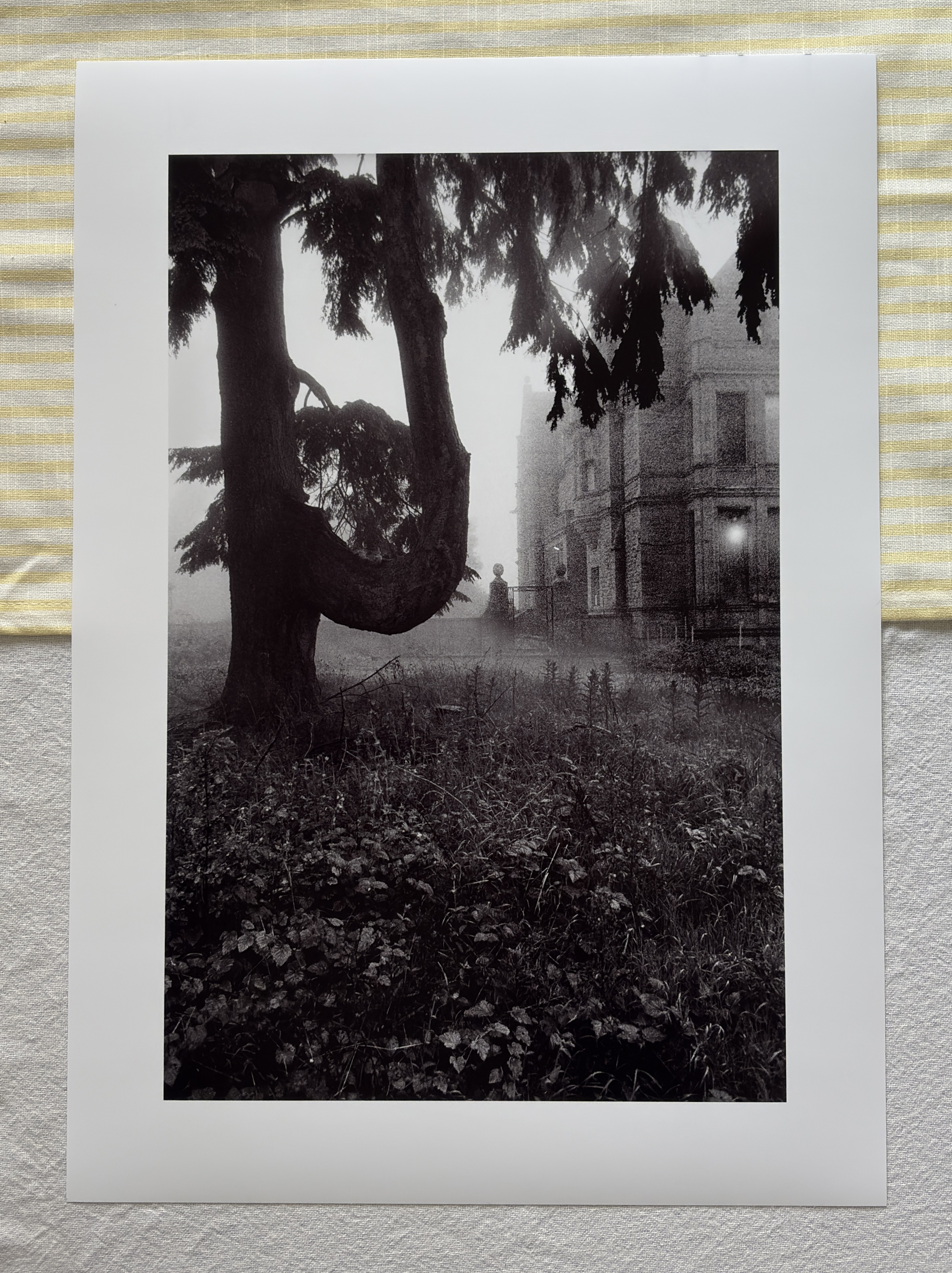
There were a few other tweaks here and there such as accentuating the different tones in the overhanging foliage at the top to emphasise the mist. The foreground vegetation was low contrast so I selected that area right up to the base of the tree and gave it a bit of oomph. The sky to the left of the tree was burned in a bit to tone it down and the highlights on the tree trunk were dodged a little.
As I said to Phil, I suppose a really creative darkroom worker like the late Larry Bartlett could have achieved something similar under an enlarger but it wouldn’t have been easy. The tree needs grade 3, the foreground grade 4 and the house grade 5. It might have been possible to do a basic grade 5 exposure to get the house right and then burn in the other parts of the pic at lower grades.
That’s what I found frustrating about darkroom printing, though. More or less straight prints were great but this sort of thing drove me bananas and used a lot of paper. I usually gave up. It was certainly a joyous occasion when I could pop a neg in, do a test strip and then produce a one exposure, one grade print - but, given the type of photos I like to take, it didn’t happen often.


You obviously can't achieve the perfect negative Bruce! Nah, just kidding - I like the end result - it's a difficult contrast range to handle and you have brought it together well - well done.
ReplyDeleteSorry for being so tardy in not replying to posts, however I do not get notified at all - maybe you could try doing it via Mailchimp? They seem to get through when all else fails.
As for the move - I bloody hope this is the last one - getting fed up of you moaning on about all the work you have to do!
Fair to say that me and the perfect neg are perfect strangers. 😂
ReplyDeleteAbsorute Borrocks (as they say in Japan)
DeleteReally nice, Bruce.
ReplyDeleteDave Jenkins
Thank you, Dave.
Delete