Well, here’s something I never thought I’d ever be writing about, especially in relation to inkjet printing.
A densitometer is as exotic to me as a fusion reactor and yet it’s now part of my everyday language. “Cath, have you seen my densitometer?” “Yes, it’s in the corner beside your spectrograph.” Don’t worry, I don’t have a spectrograph. Yet.
But I’m sure you get the idea. Densitometers were the preserve of men with beards and Ansel in their names. However, for the inkjet printing I’m doing there’s a good reason to have one. It’s for the linearisation process in relation to the QuadTone Rip software I’m using as a print driver. That’s just a fancy way of getting all the tones on the PC monitor to retain their relationships in the print. Much like the old what-you-see-is-what-you-get.
I have to measure the densities of 21 tones on a step wedge and then tell QTR what adjustments to make so they all come out the way they should in the print.
To be honest, I’ve been really happy with the prints I’ve been getting and I’m not sure if linearisation will make much difference. The tests I’ve done suggest that I could have greater shadow separation so that’s what I’ll be concentrating on.
No expense has been incurred for this exercise. My ancient, battered Agfa densitometer cost all of £25. I bought it from a guy who lives 375 miles from me but, coincidentally, just seven miles from my daughter and her fiancé so they kindly picked it up on Boxing Day and handed it over at our get-together last week in Kirkmichael.
I’ve just fired it up and it seems to be working fine although there were no instructions so I hope I’m using it properly. It also seems to be quite accurately calibrated as it’s giving me readings for maximum black that are about where I think they should be.
I’ll not have much time over the weekend but maybe on Monday night I’ll be able to start the linearisation process and then we’ll see if it’s been worth it.
Yesterday I switched my inkjet printer cartridges around so that I now have three dye black cartridges and three pigment blacks taking up the six spaces. The three dyes will be used for printing on satin and glossy paper and when I want a cool tone on matt paper and the three pigments for warm tone prints on art paper.
The pigment ink needs a bit of tweaking as the shadows are looking a bit muddy but considering I’ve only installed the cartridges and done nothing at all to optimise them they’re looking OK.
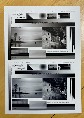
If you want to know the difference in tone between the two inks then this pic should give you an idea. The pigment is a bit too warm for my taste but I think it should be possible to combine the two inks to tilt the tone one way or another. The difference in print tone is slightly exaggerated by the iPhone camera so it’s more subtle than you’re seeing here.
It’s quite good being able to select a different print tone like this where no colour inks are involved so there are no issues involving colour casts or shifts in different lighting. Those were the problems that put me off inkjet printing first time around.
 |
Test image from printing guru |
After publishing this post, the difference in colour tone as it appears in the iPhone pic was bothering me so I took a quick pic of my test prints alongside a photo in Fay Godwin’s Land so you have a point of reference.


0 comments:
Post a Comment